Messy play with qualitative data
| 7 March 2019 | News
It’s World Book Day, and for many parents this means getting the dreaded craft box out and spending increasingly fraught hours making a costume or book character out of a potato, wooden spoon, hard-boiled egg etc. Surveying the chaos left after last night’s efforts reminded me of the (much more enjoyable) recent Qualitative Research Symposium at the University of Bath. This year’s theme was Myths, Methods, and Messiness: Insights for Qualitative Research Analysis, and presentations by research teams and doctoral student provided a fascinating insight into a variety of experiences dealing with complex and messy data.
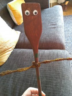
Taking the simplest path is sometimes the best way – Julia Donaldson’s Stick Man
In the same way that seeing other wooden spoons’ eyes fall off on the walk to school reassures you that you are not alone, seeing other researchers struggle to make sense of long and complex qualitative data was a refreshing burst of honesty and collaboration, reminding me of the importance of our continuing journey with the QuIP. James Copestake and I presented our own experiences dealing with the messiness and uncertainty of QuIP studies, from grappling with how to code the distinction between necessary and sufficient drivers of change, to deliberating with commissioners over how they interpret, present and represent the data in an interactive dashboard.
Dealing with and making sense of long transcripts can seem like a world of dark arts to a busy monitoring and evaluation officer. Most people are very keen to get beyond the quantitative metrics and read the stories behind the numbers, but representing the narrative accounts in more than an anecdotal summary is where it becomes tricky. The QuIP approach to analysing data tries to strike a balance; on the one hand, representing the text accurately through inductive coding – not trying to slot responses in to pre-set tables or simply count word instances; on the other hand, cutting down on time and complexity by only looking for and coding stories of change – rather than trying to capture a detailed picture of day to day life or quantifying change.
The work we have done in trying to make this analysis more accessible, through an interactive dashboard which invites commissioners to play with the data, is an attempt to try to build a bridge between the richness of qualitative data and the flexibility of quantitative data – but we know there are inherent risks in releasing data into the wild like this.
We are certainly down at the more complex end of the spectrum in the world of evaluation where budgets and deadlines mean that indulging in full throttle messy play simply isn’t an option, but in the world of qualitative analysis we are working at the more ruthlessly simple end of the spectrum. For me, this is a happy and important place to be. Our work continues to evolve, and I would be the first to admit that there is still much to do to represent perceptions of change more accurately. But I was heartened by the response to our work at QRS, and inspired to continue trying to tackle these thorny issues, learning with every new project.


Comments are closed here.