Data Analysis
A common issue with qualitative impact assessment is how to organise and make sense of large quantities of textual data, and to do so in a way that is transparent, so that generalisations drawn from it can be peer reviewed. We use a thematic analysis inspired approach to coding, employing standard routines to aid speed and transparency. Coding is predominantly inductive, simply using what is contained in the narrative text to identify specific causes or drivers of positive and negative change.
Analysts look for cause-and-effect statements, tagging them with factor labels which describe the driver (influence) or outcome (consequence). These labels can also use optional extra flags to help the analyst identify particular factors which may be explicitly related to an intervention or event, or even just whether respondents described effects as positive or negative. Once coding is complete it is possible to query the data set, looking for causal relationships and patterns which can be visualised in network diagrams – causal maps. This allows analysts to see causal relationships between drivers and multiple related outcomes.
Various software packages are available on the market to assist with the task, but none have the specific focus on causal connections that is required for QuIP-style coding. Having used Excel for years (which is a good interim solution!), Bath SDR eventually invested in a bespoke data analysis solution which is designed to focus on causal connections and speed up the coding and analysis process. We therefore use Causal Map to trace connections between influences and consequences coded in the text.
Using Causal Map enables us to see maps building up as we code, showing connections between different factors.
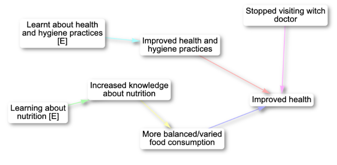
As well as interactive maps, print view versions are also available.
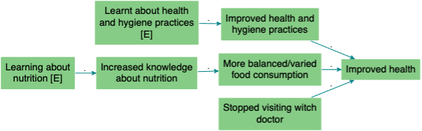
Once complete users will see a larger aggregated map; this allows for detailed analysis of different cause-outcome configurations which can be viewed by thematic areas of interest.
An interactive reporting dashboard also allows analysts to:
- analyse causal connections at aggregate or granular levels
- filter and compare by attribution, variables and respondent characteristics
- visualise data to help report on complexity
- connect immediately to the coded data behind the visualisations
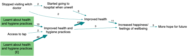
The filtered map below uses conditional formatting on the arrows to show how different types of respondents (from two Provinces: A and B) related their stories.