Using QuIP and the Causal Map app in PhD research: Understanding how social protection influences asylum seeker wellbeing in the UK
| 20 March 2023 | News
We are grateful for this guest post from Michelle James. Michelle is a PhD researcher specialising in refugee and asylum seeker welfare and wellbeing in the UK. She also works as an independent research consultant in the development sector. Her particular interests include partnership models of development, community empowerment and mobilisation, and behaviour change.

I am currently in the final year of a PhD in Social Policy at the University of Bath looking at how different forms of social protection impact the wellbeing of UK asylum seekers. As an experienced QuIP analyst, already impressed by the benefits of the research tool, I knew that I wanted to incorporate QuIP data collection and analysis into my PhD methodology. Collecting data from a hard to reach, linguistically diverse and potentially vulnerable population during the covid pandemic was, however, far from straightforward.
My anti-oppressive research approach led me to adopt research tools that I hoped could empower participants to enact agency within the project, minimise the extractive nature of data collection, while still generating the academically rigorous data I required for my PhD. I also needed to gather data that helped me understand what impact government, community and peer-led social protection was having on UK asylum seekers without asking leading questions to minimise response bias. As such, I chose to utilise two main data collection tools, supplemented by a range of additional data to triangulate my findings.
Firstly, I trained asylum seeker/refugee peer interviewers to independently undertake QuIP interviews with those in their social network. The interviews asked participants what changes they had experienced in their lives since being dispersed to their current location by the government and who/what they attributed these changes to. I hoped that the peer interviewers would benefit personally from involvement in the project through gaining work experience that they could cite when applying for future employment. In addition, evidence suggests that asylum seekers fear speaking to British institutional researchers so I also hoped that participants may have more confidence to take part and provide detailed answers if speaking with a peer in their own language.
Secondly, I undertook a photovoice project with ten asylum seekers/refugees who each captured a series of images to depict what made their lives easier/happy or harder/unhappy. The images were shared and discussed in depth by all participants at a follow up workshop and the photographers collaborated with me to put on an exhibition of their work in Summer 2022. Check out the online version of the exhibition here.
The QuIP interview data, photovoice narrative statements and workshop transcript were uploaded to Causal Map, alongside survey data, peer researcher and photographer feedback interview data, and exhibition feedback statements. The Causal Map app allowed these different types of data to be effectively analysed in one place, uncovering themes and causal patterns through an inductive process. Although the data were consolidated into one Causal Map project file, the software made it possible to separate and interrogate different categories of data independently when creating visualisations to understand which data were useful in answering different types of questions. This resulted in the creation of a sub-group of key informants (QuIP interviewees and photovoice participants), whose data were used to look at the breadth and depth of significant of different types of social protection on wellbeing, with the remaining data incorporated only when applicable to specific research questions.
Once the Causal Map visualisations were created, I incorporated them into my thesis alongside pertinent quotes and photovoice images to offer a more rounded qualitative and pictorial description of the wellbeing changes expressed by research participants and the impact of different forms of social protection. For example, the causal map visualisation to the right shows how government-based social protection was impacting the lives of asylum seekers at the time of data collection.
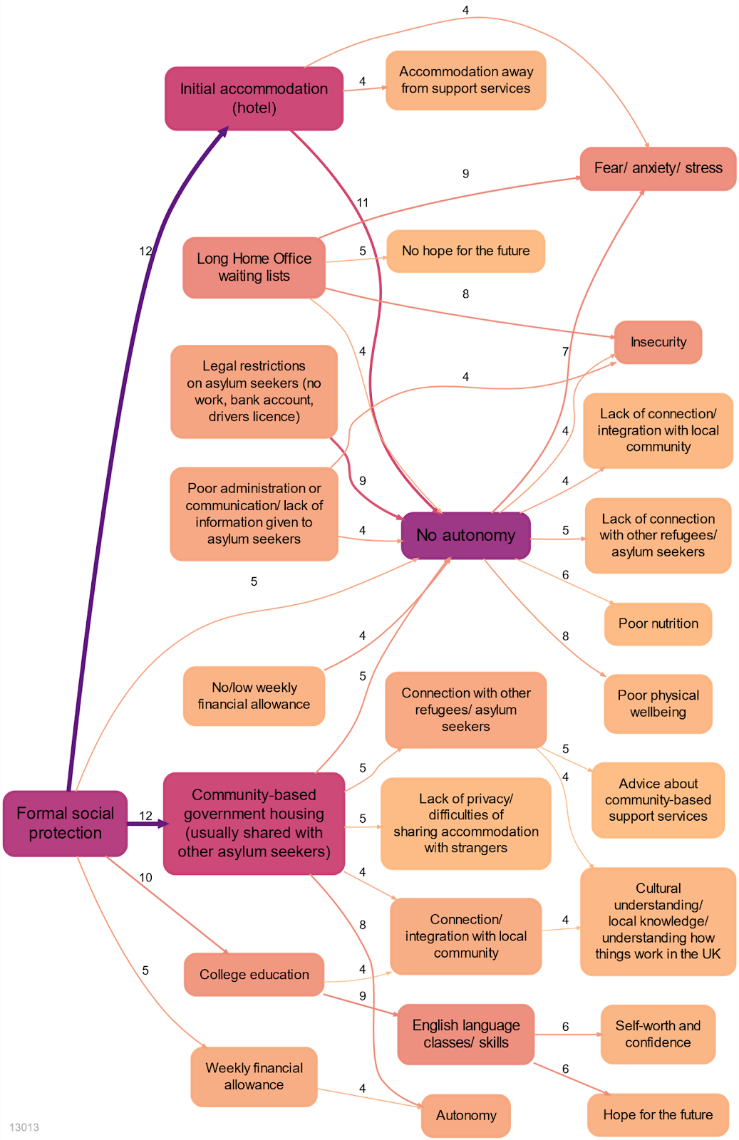

In my thesis, this was accompanied by a range of photographs and quotes to drill down on the causal links expressed in the diagram. One example photograph and quote can be seen to the left and below.
“It is not easy for an asylum seeker to stay in a hotel room for months. You spend many hours alone, it is very isolating. Hotels are often a long way from support services and you have no money for bus tickets to reach them.”
Photo title: Modern Jail
Image and text: W, asylum seeker, Afghanistan, 2022
Finally, the causal links and themes unearthed through inductive analysis using the Causal Map were considered alongside relevant theory and literature in my thesis leading to a number of policy and research recommendations for the improvement of social protection provision for UK asylum seekers.
Following helpful training by the Bath SDR and Causal Map team, I was able to interrogate the data to create helpful visualisations to answer each of my main research questions. The quantitative nature of these causal maps is helpful for top-level policy discussion, while the retention of and ease of access to the qualitative data that underpin the diagrams is important for research transparency and to support a more qualitative and theoretical discussion of the main causal links found in the dataset.


Comments are closed here.