Causal mapping – the next frontier
| 28 November 2019 | News
A guest blog by Steve Powell who is working with Bath SDR on solving some of the knotty problems encountered in analysing and using causal connections – the heart of so many evaluations.
As programme evaluators, we often have to deal with heaps of causal claims, for example that X causes Y, or causally contributes to it. When Bath SDR works with clients to conduct a QuIP evaluation, the field researchers conduct and document a series of interviews in which key informants share their experiences and perceptions of what has caused, or contributed to change. How to process this heap?
In this post we want first to revive an old name, ‘causal mapping’, for the task of dealing with this kind of heap, and also to talk about tools.
Programme evaluators, and social scientists in general, are often confronted with the task of sorting and analysing narrative data like this. Maybe you have some open questions at the end of a questionnaire in which people are making causal claims. Perhaps you have to do a meta-evaluation in which you combine information from different more or less authoritative documents. Sometimes you might conduct a series of interviews in which you directly ask people questions like “what causes what?” or “what contributed to this event?” You might even try to gather causal claims and merge them straight away them into an overall picture, as a participatory process with a group.
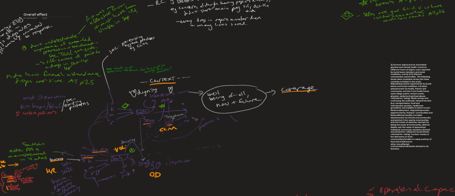
Notes taken for an Ebola meta-evaluation, as an early draft of a causal map
Information about causes, causal contributions, or people’s informed views about causal contributions; all of this is gold to a programme evaluator or social scientist. We need to be able to collect, store, process, combine, analyse and display this kind of information, and do it easily and well. In the evaluation literature there is much less discussion of these kinds of task compared to the amount of discussion around the questions of how one should deal with numerical or even so-called qualitative information as usually understood.
Collecting, storing, processing, combining, analysing and displaying causal data, the set of tasks which we collectively call ‘causal mapping’, are different from the related tasks involved in dealing with ordinary numerical or textual data. To take one example: storage. We can store sets of numerical data in structures like spreadsheets. We can store a set of interview or other text data as a (physical or electronic) folder full of documents. Causal mapping may itself involve extracting causal claims from statistical or narrative data, but how do we then store the extracted causal connections? The obvious candidate is as a directed graph: a set of boxes joined by arrows, to show what causes what (or what causally influences what). Each individual causal claim is represented by one arrow in the diagram (or in some cases, by more than one arrow).
Causal maps are obviously good for the tasks of displaying sets of causal claims, but we aren’t used to thinking of diagrams or networks also as a way of storing information. There is a range of modern software tools such as graph databases which do just that, in which the basic unit of information is not a number or a sentence but a link between two or more items.
Causal maps are also useful as summaries of causal information, central to much research and evaluation; a way of expressing the main findings, what we really wanted to know. Does X causally influence Y? Did B contribute to C? What else has to happen? How sure can we be?
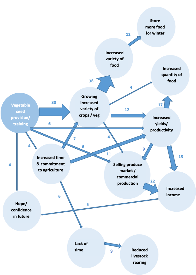
A summary causal map produced as part of a QuIP evaluation
Many of the different kinds of diagrams in use in evaluation and social science, from the strictly quantitative to the thoroughly qualitative, can be considered to be causal maps. For example, ‘theory of change’ is a very popular name for a particular kind of causal map in which valued outcomes and the means to influence them are specifically included. ‘Structural Equation Models’, as used by some evaluators in statistically-based evaluation, can also be considered to be causal maps.
The fact that causal mapping is used in very different kinds of evaluation makes the concept particularly interesting as a way to unify some diverse approaches. The phrase Causal Mapping goes back at least to Axelrod (1976), and the idea of wanting to understand the behaviour of actors in terms of internal ‘maps’ of the word which they carry around with them goes back to Kurt Lewin and the field theorists. In evaluation theory, Causal Mapping appears from time to time in both qualitative and quantitative writing about programme evaluation.
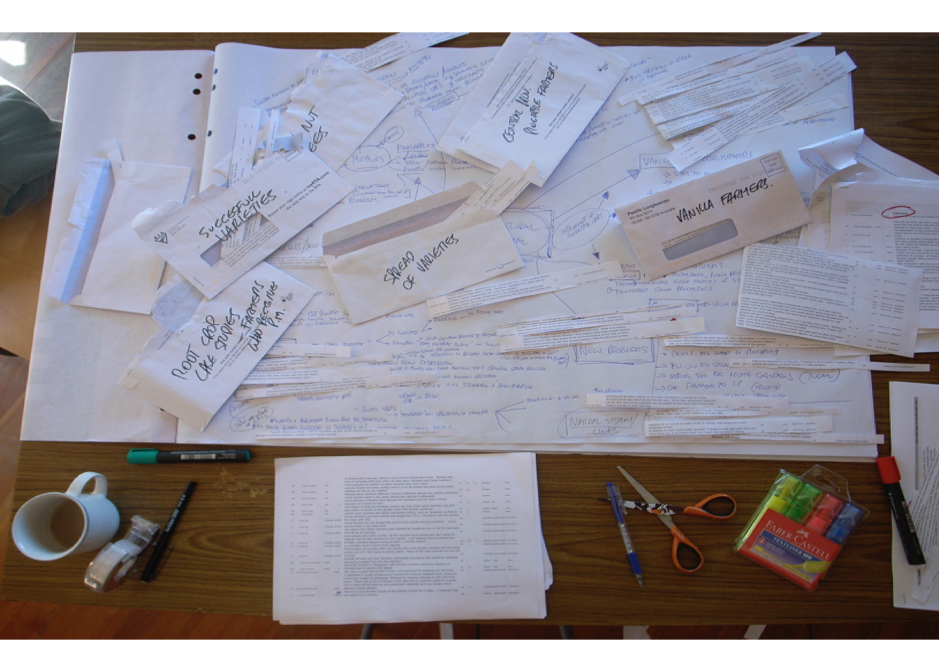
Anyone who has ever tried to store and combine fragments of causal information, for example to summarise the causal claims in a set of interviews or documents, will know that it is difficult without specialised tools. Often, the long-suffering evaluator ends up with a frustrating mashup of spreadsheets, scraps of paper and tape.
The task becomes particularly difficult when it is important to keep information about the source of a causal claim firmly attached to it, in order to, for example, to be able to show later only the claims made by women, or older people.
QuIP uses a series of workaround tools to address this problem; using powerful combinations of Excel and data analytics software such as MicroStrategy. However, these involve many steps of data processing and restructuring which mean the solutions are not easily accessible to users. They are also not designed for this purpose, so users have to accept a number of frustrating limitations in data coding options.
As a freelance evaluator I have been working on similar problems for a few years, including a prototype web app designed to solve them. Earlier this year I joined forces with Fiona at Bath SDR to work on a specially designed and fit-for-purpose tool suitable for QuIP, and also many other users who have similar needs with different types of data.
We plan to launch the Causal Map app in 2020, a tool to help social scientists and programme evaluators extract causal claims from text sources and to combine and present them visually. The software is under development, but we are using it right now to process data from QuIP studies.
We are really excited that having better tools for causal mapping will make it easier to solve some of the central problems facing programme evaluators, whatever approach you use to collecting stories of change. Bath SDR plans to introduce the software in phases, alongside their existing interactive dashboard, and will be seeking feedback from users, so watch this space!


1 Comment
Interestingly, I’ve also been working on causal mapping as a freelance evaluator. See our book, Practical Mapping for Applied Research and Program Evaluation, and our articles and webinars on causal mapping, available at http://meaningfulevidence.com/